3D embroidery: Turning simple logos into textured details
Bring your brand to life
Explore over 1,000 customisable products designed to showcase your brand and leave a good impression.
People assume the hard part of 3D embroidery is getting the raised effect right: lifting a logo off a t-shirt so it looks expensive. It isn't. Foam does that reliably enough on its own. The hard part is deciding what the foam should never touch: the fine line, the small type, the logo that only works flat. Get that decision wrong and the raised effect becomes the reason a design fails, not the reason it works.
What 3D embroidery actually is
3D embroidery, also called puff embroidery, places a layer of foam under the stitching before the machine runs. Dense satin stitches pass over the foam and lock it into the thread. Once the stitching is done, the excess foam is trimmed or burned away with heat. What is left is a raised, tactile mark instead of a flat one.
Preparing the design
The design work starts before a needle moves. A flat logo does not become a 3D one by adding foam under the existing file. It has to be redigitised for the extra height: wider stitches, reinforced outlines, shapes bold enough to hold their form once lifted.
Fine detail and small text do not survive this. A thin line or a six-point wordmark collapses into the foam and reads as a blur, not a logo. We say so before the machine runs, not after.
Where it holds up
3D embroidery works on structured surfaces: caps, hoodies, jackets, workwear. Structure gives the foam something to push against. A soft or stretch fabric gives it nothing, and the raised shape sags or shifts with the garment instead of holding still.
Caps are the strongest case. The crown is stiff, the placement is usually front and center. The logo is usually simple too: a wordmark or a mark, not a full scene. That simplicity is what lets it survive the format.
What it costs to get wrong
Two mistakes repeat. The first is a design too detailed for the technique: fine lines, small text, gradients, none of which the foam can carry. The second is the wrong fabric, one too light or too stretchy to hold the raised shape through washing and wear.
Both are avoidable at the proof stage. Both are expensive once the run is stitched. A 3D logo that has flattened or shifted after a few washes does not look considered. It looks like a mistake someone should have caught earlier.
The process also takes longer and costs more than flat embroidery: more material, more digitising, more machine time. That is a trade a client is making, not a detail to bury in the small print.
Matching the technique to the product
3D embroidery earns its place when the goal is one bold mark on a structured garment that people will handle and wash for years: a cap, a team jacket, workwear that stays in rotation. It is the wrong choice for a detailed crest, a full-colour scene, or anything going on a soft or stretch fabric. Standard embroidery or a print technique will hold those better than foam ever will.
Foam, satin stitch, structure, restraint. That is where 3D embroidery earns its place. And the question underneath it: whether a design is bold enough to survive being lifted off the fabric, or only looks right lying flat.
About the author
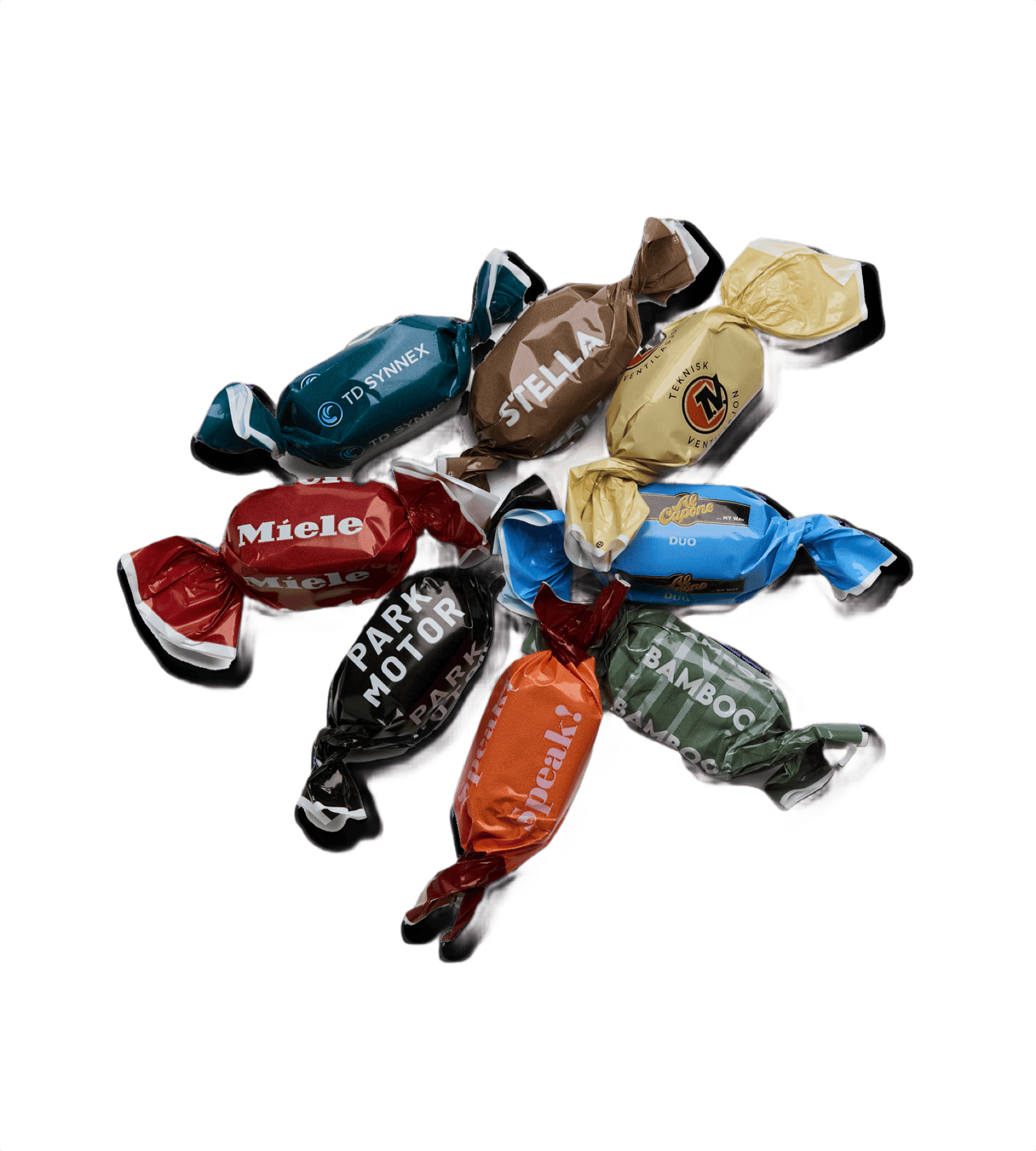
Chocolate Coated Caramel (1kg)
Wood Tee 55mm White (1000 pcs)
Blaze Micro Light