Debossing: The finish you feel before you see
Bring your brand to life
Explore over 1,000 customisable products designed to showcase your brand and leave a good impression.
Most people think debossing is a logo decision: pick a good design, press it in, done. It isn't. A recessed mark reads only as well as the material lets it, and no clever artwork saves a die pressed into stock that's too thin to hold it. The real decisions happen before the press ever comes down: material, depth, and whether the design can survive losing its colour.
What debossing actually is
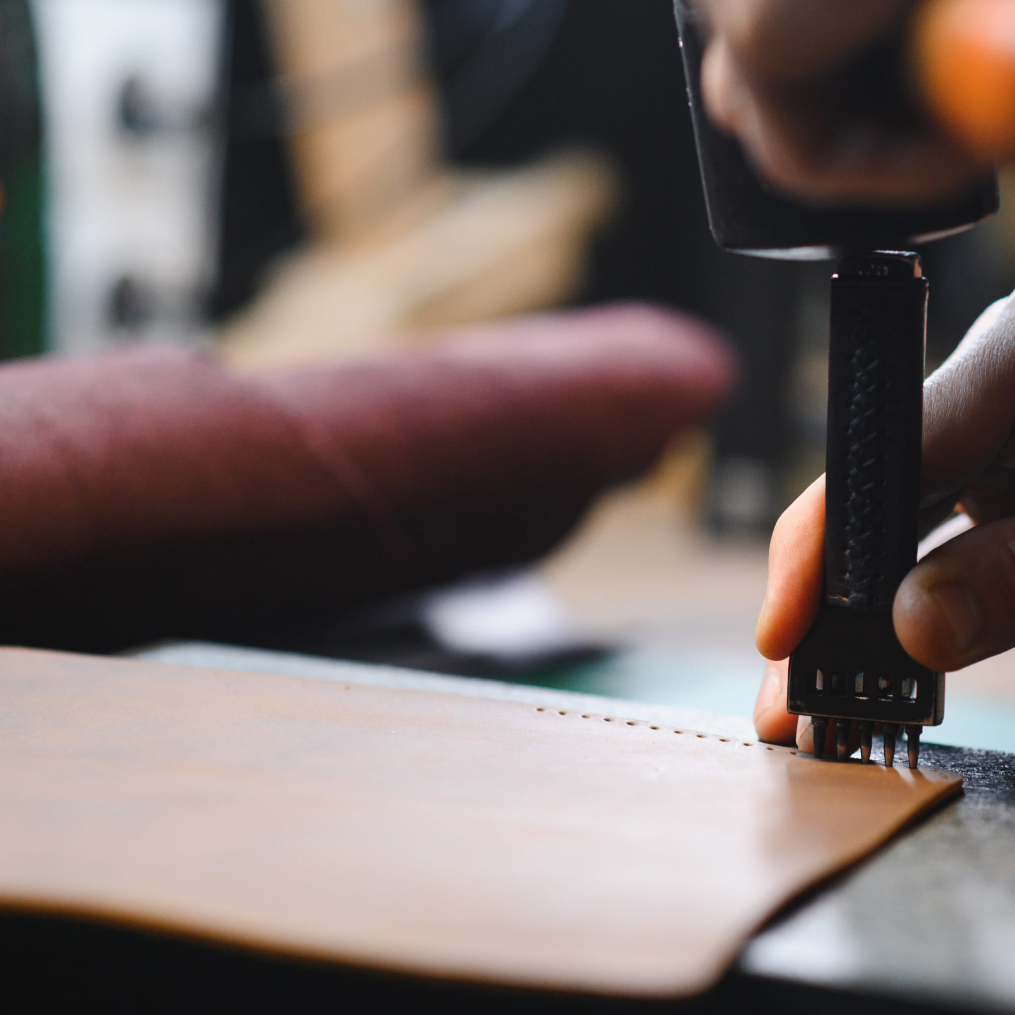
Debossing presses a design into a surface instead of raising it. Embossing pushes the material out from behind; debossing pushes it in, using heat and pressure rather than ink. There is no printing step, no colour, no drying time. The mark exists because the material has been physically reshaped, and it lasts for as long as the material does.
How we set it up
We start with a die: a metal plate engraved with the client's design, usually cut with a laser or chemical etch once the artwork is finished in CAD. The die is heated, pressed into the material under a set pressure, and held until the material cools around the new shape.
Depth is not a setting we pick once and reuse. It depends on the pressure, the temperature of the die, and what the material can take. Thin card and soft leather behave differently under the same die, so we run a test press before committing to a full batch. Some designs come back from that test needing rework: fine detail collapses, thin lines disappear, and the client gets a simpler version than the one they sent us.
Where it earns its place
Notebooks, leather covers, folders, packaging, business cards: debossing turns up wherever the goal is felt quality rather than shouted colour. A logo pressed into a notebook cover reads as considered in a way four-colour print on the same cover does not. Publishers use the same technique on book covers and slipcases, for the same reason.
It is not the default choice. Most of what crosses our desk for gift boxes and onboarding kits still goes to print, because print is faster and colour sells better on a shelf. Debossing is for the items a client wants someone to pick up and turn over.
What it won't do
Debossing carries no colour. The whole effect comes from depth and the shadow it casts, so a logo built around contrast or multiple tones will not survive the switch. Fine text is a similar problem: a die needs enough surface area to hold a shape, and letterforms under a certain size blur into the material rather than sitting in it.
Material matters as much as design. Thin or fragile stock tears or flattens under the pressure a clean deboss needs, so we turn materials away before we turn artwork away. The die itself only pays for itself at volume: cutting one for a run of fifty notebooks is money spent on an effect nobody but the client will ever notice.
Choosing the right fit
Debossing suits a brand that wants its mark to feel crafted rather than printed: leather, thick card, rigid packaging, the kind of material that holds an impression instead of losing it. If the design depends on colour or fine detail, we say so before the die is cut, not after.
Material, depth, die cost, restraint. That is our corner of the business. And the question underneath it: whether a brand wants to be seen, or wants to be felt.
About the author
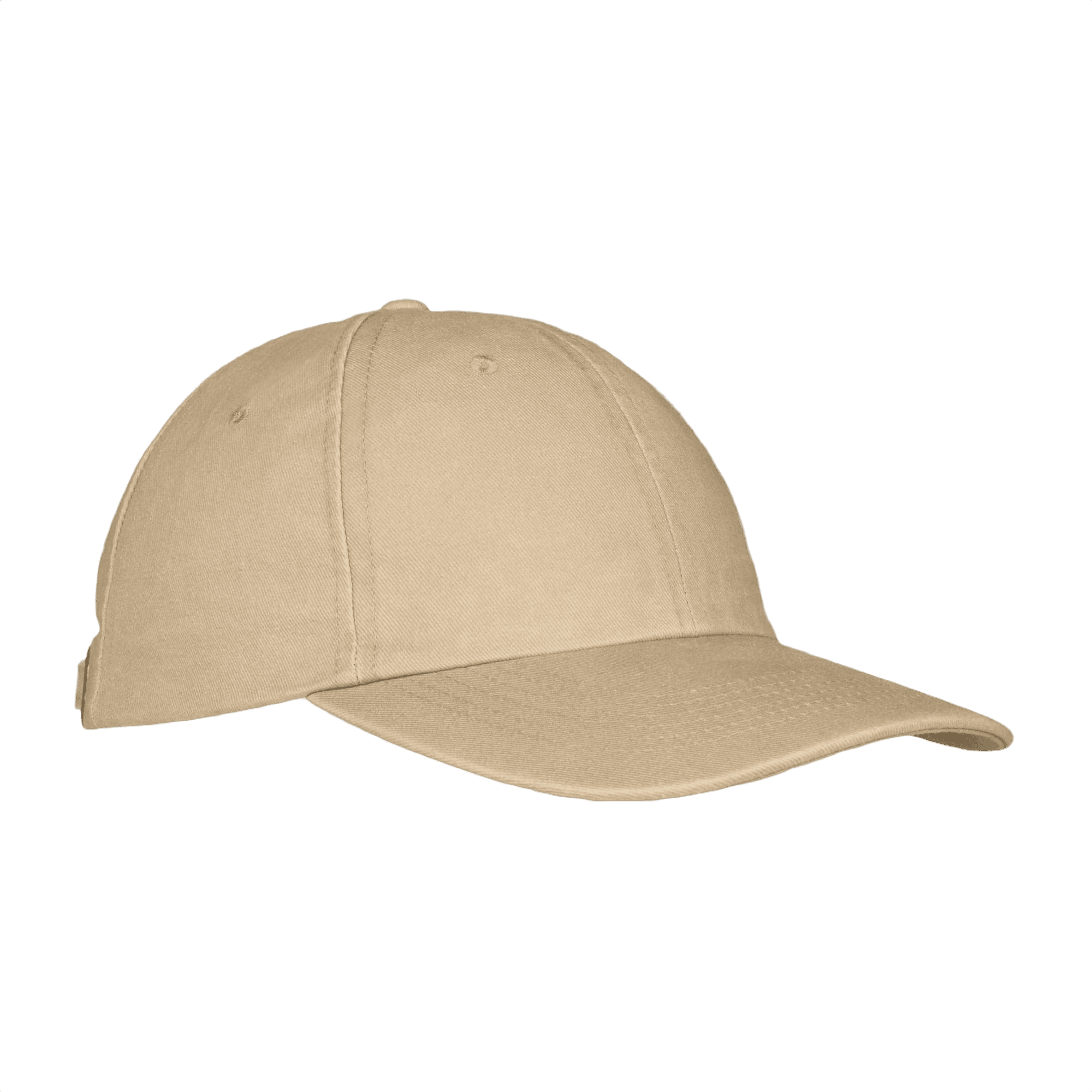
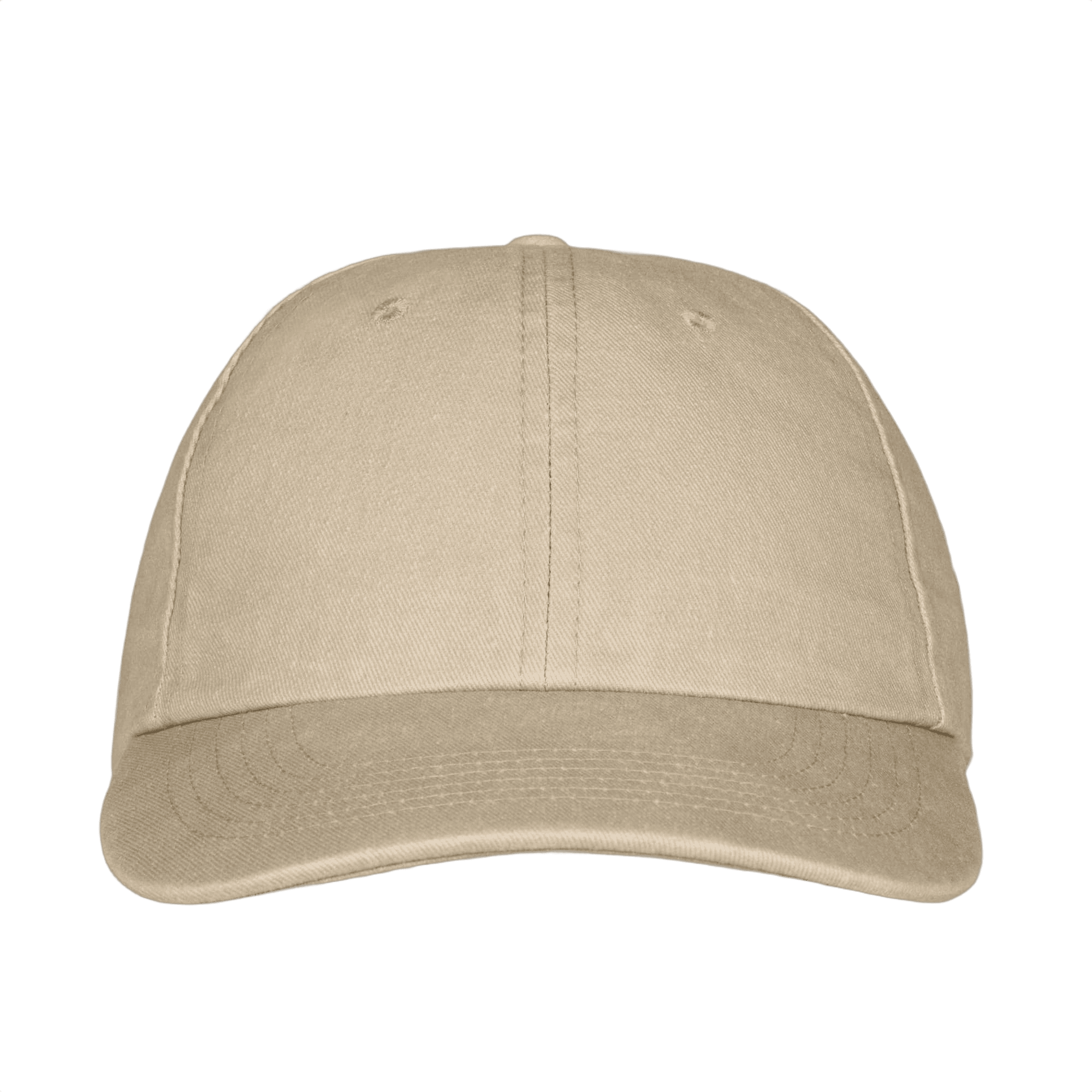
Cotton Baseball Cap 260 g/m2 6 Panels
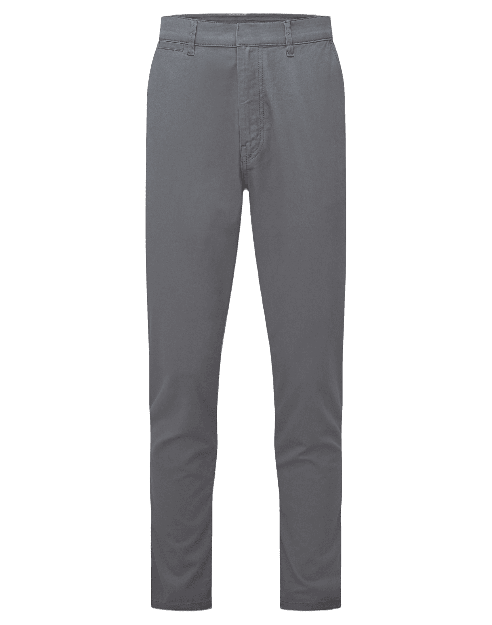
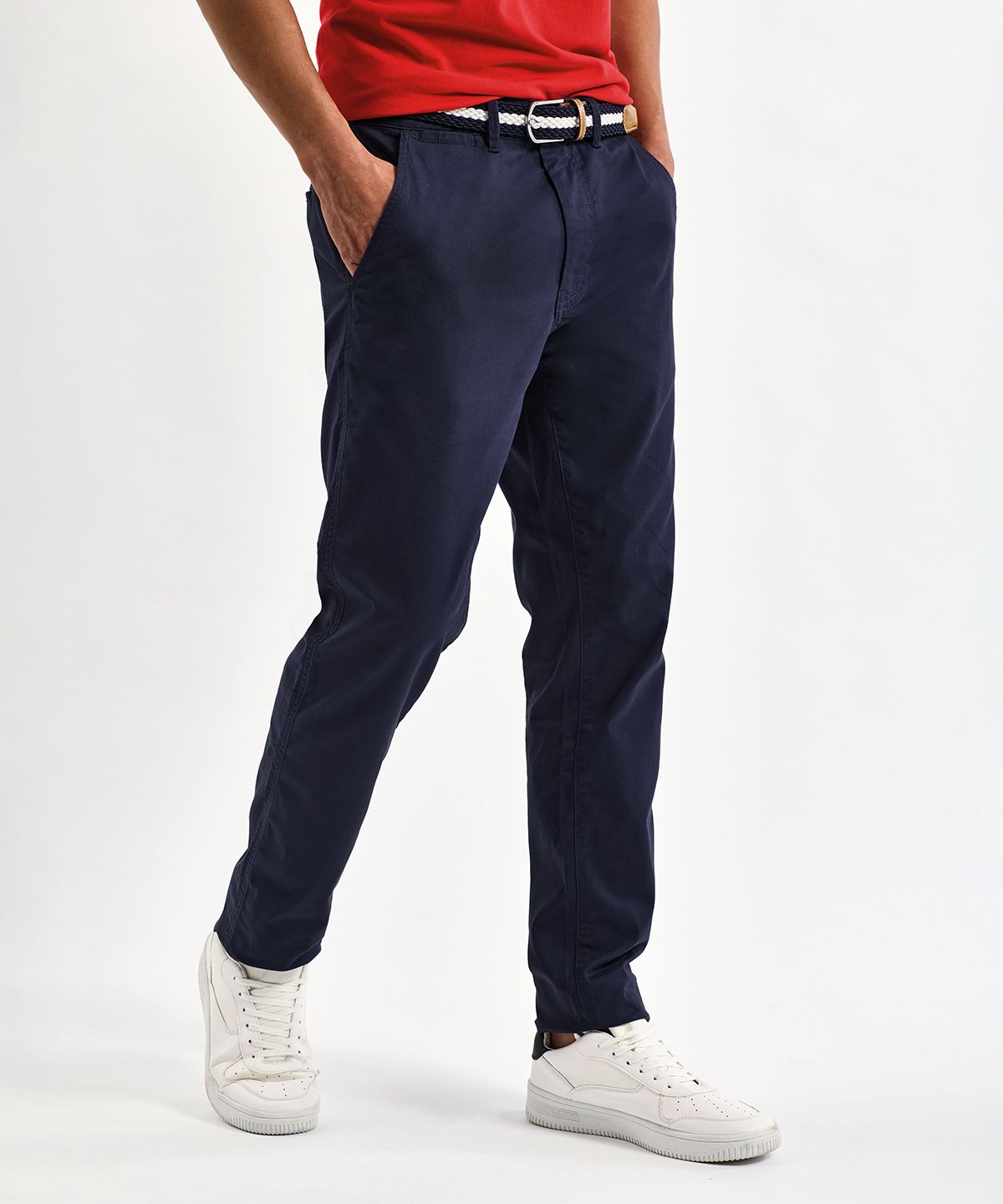
Ultimate Chinos Men Regular
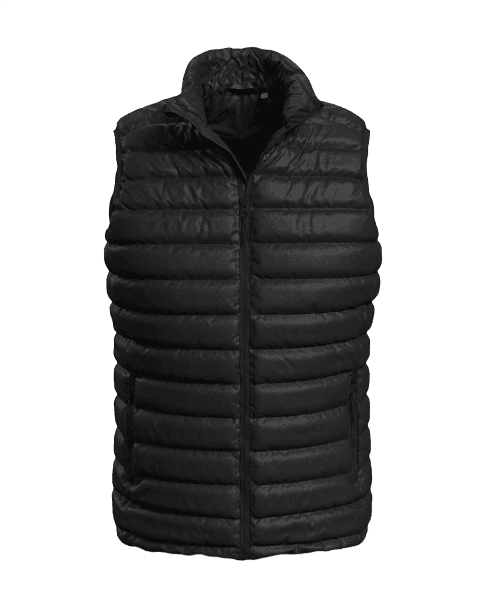
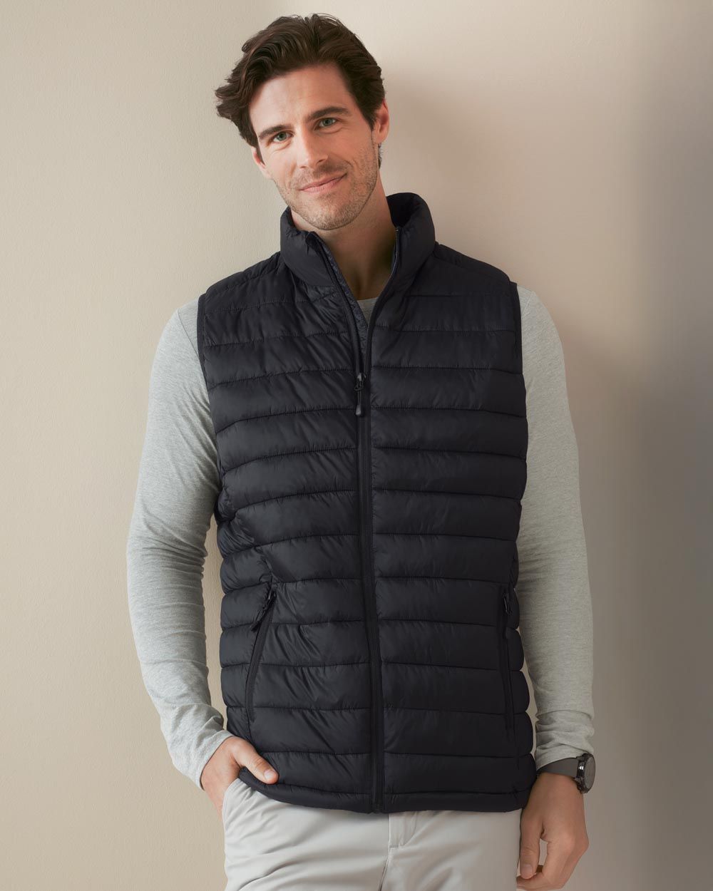
Stedman Lux Padded Vest Men