Screen printing: When simple colors need strong impact
Bring your brand to life
Explore over 1,000 customisable products designed to showcase your brand and leave a good impression.
The part that takes seconds and the part that takes days
Most people think screen printing is the squeegee pass: ink pushed through mesh, a design landing on fabric in one motion. That part takes seconds. The hard part happens before it and after it: exposing a stencil precise enough to survive a full production run, aligning several colours by hand so they sit on top of each other and not beside it, and curing every print with heat so it survives regular washing instead of coming apart after a few.
One screen per colour
That is the whole logic of the method, and everything about its cost, its timing, and its limits follows from it. A single-colour logo needs one screen. A multi-colour design needs one screen per colour, each exposed, tested, and aligned against the last. Screen printing is one of nine decoration methods we work with, and it remains the standard for anything printed on fabric in real volume.
Preparing the screen and exposing the stencil
We start with a fine mesh stretched over a frame and coated in a light-sensitive emulsion. The design is printed onto a transparent film and laid over the screen, then exposed to light. Where the film blocks the light, the emulsion stays soft and washes out with water. Where the light gets through, the emulsion hardens and seals the mesh shut. What is left is a stencil: open where the ink should pass, closed everywhere else.
Get the exposure time wrong and the stencil breaks down halfway through the run, not at the start where someone would catch it.
Applying ink and building the colours
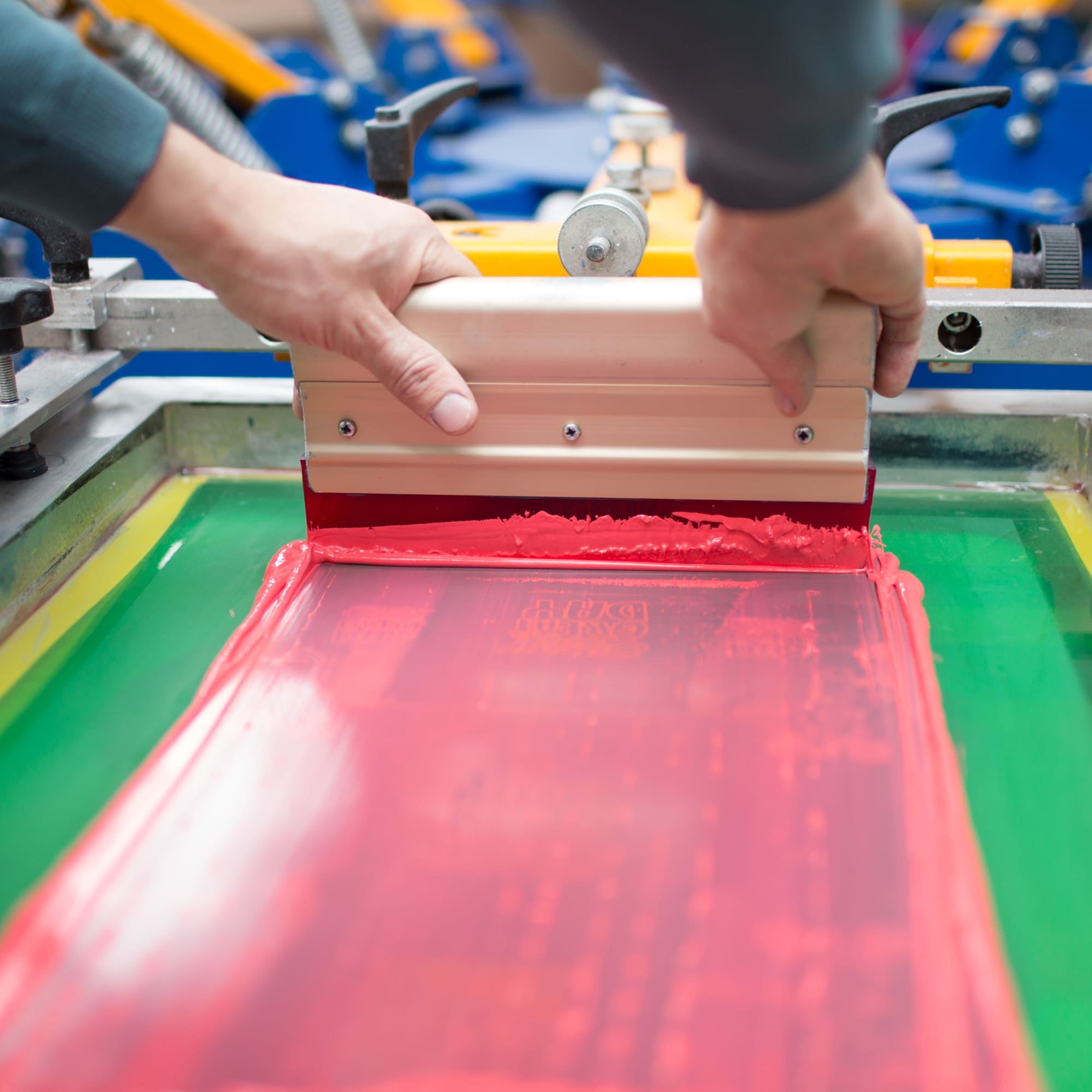
The screen goes down on the material, ink goes along one edge, and a squeegee is drawn across it, forcing ink through the open mesh and onto the surface below. Lift the screen and the design is there. For a multi-colour job, that happens once per colour, with each pass aligned against the one before it. Then the print is cured, usually with heat, so the ink sets into the fibres instead of sitting on top of them.
Skip or shorten the cure and the print looks identical on delivery day. It just does not survive the first proper wash.
Where the method is standard
Screen printing is the default for t-shirts, hoodies, and tote bags, and it holds up just as well on paper, wood, ceramics, glass, and metal. We use it across branded merchandise, event apparel, and workwear, particularly where the same design is going out in real numbers rather than a handful of samples.
What scale buys you
The ink sits in a thick, opaque layer, which is why screen printing reads clearly on dark fabric where other methods fade into the background. The prints resist washing, fading, and general handling better than most alternatives. Metallic, glow-in-the-dark, and raised puff inks are all options within the same process.
The cost of the screens is paid once. After that, the price per unit drops with every additional piece, which is what makes the method genuinely cheap at scale and genuinely expensive on a small order.
Where it stops making sense
Every colour is a separate screen and a separate pass, so cost rises with colour count in a way a busy, photographic design cannot outrun. Smooth gradients and photographic images do not translate either: the technique prints in solid blocks of colour, not continuous tone. Most of what arrives as a photo-realistic mockup gets redirected to digital printing before it ever reaches a screen.
Choosing it for a project
Screen printing earns its place on textile products and flat surfaces where the print needs to survive years of use, at quantities where the up-front screen cost stops mattering. For a short run or an image with fine colour gradients, we point clients toward digital printing instead.
Mesh, stencil, squeegee, cure. That is our corner of the business. And the question underneath it: why some printed shirts still look sharp after years of washing, and others fade within weeks.
About the author
R-PET Bluetooth Speaker v5.0
Blaze Head Lamp