Corduroy isn't a throwback. It's a deliberate pace

Bring your brand to life
Explore over 1,000 customisable products designed to showcase your brand and leave a good impression.
What people assume, and what it actually signals
Corduroy gets read as retro, a wink at some decade rather than a decision made now. That's not quite what it's doing. What corduroy signals is pace: unhurried, considered, in no rush to look current. A brand that puts its logo on corduroy is saying it doesn't need to trend, which is a harder thing to fake than the texture itself.
How the pile actually gets made
Corduroy starts as a base fabric with extra sets of fibre woven in, which are then cut to raise the pile into the ridges everyone recognises as wales. The number that matters is how many wales fit in an inch: fewer means a wide, chunky cord with real presence, more means a fine, almost smooth surface that barely reads as corduroy from a distance. Same construction, calibrated differently, and the two versions communicate almost opposite things even though they came off the same kind of loom.
Where it earns its place in branded products
Corduroy isn't a high-volume material in merchandise, and that's part of what makes it work. Caps, tote bags, and small accessories are where it shows up, formats where a distinct texture adds something a flat fabric can't. Creative, publishing, education, and lifestyle brands get the most out of it, because it communicates a kind of quiet individuality without a paragraph of explanation. Put it on a high-volume conference giveaway meant to be forgotten by Monday, and the whole point of choosing something considered gets lost in the pile.
What's worth planning around
Corduroy is warm by nature, which puts it firmly in an autumn and winter merchandise programme rather than a summer one, and that seasonality has to be planned for rather than discovered after the print run. The pile also takes more care in printing and embroidery than a flat surface: a design that would sit cleanly on cotton can lose definition in the ridges, and that changes both the technique and the lead time. Skip that conversation and the cap comes back with a logo that reads fine in the mockup and blurred in the hand.
What it says without a word of copy
There's nothing hurried about corduroy, and that's largely the point. It doesn't chase a trend and it doesn't disappear the moment one passes. A brand that chooses it is usually choosing texture, a bit of history, and a slower sensibility over whatever's current, and merchandise built to feel considered rather than reactive tends to do that work quietly, without a tagline explaining it.
The corner of the business this is
Wale count, cut pile, a warm-weather limit, more care in the print. That's our corner of the material side of the business. And the question underneath it: does the texture say the brand took its time, or is it just the fabric that happened to be in season.
About the author
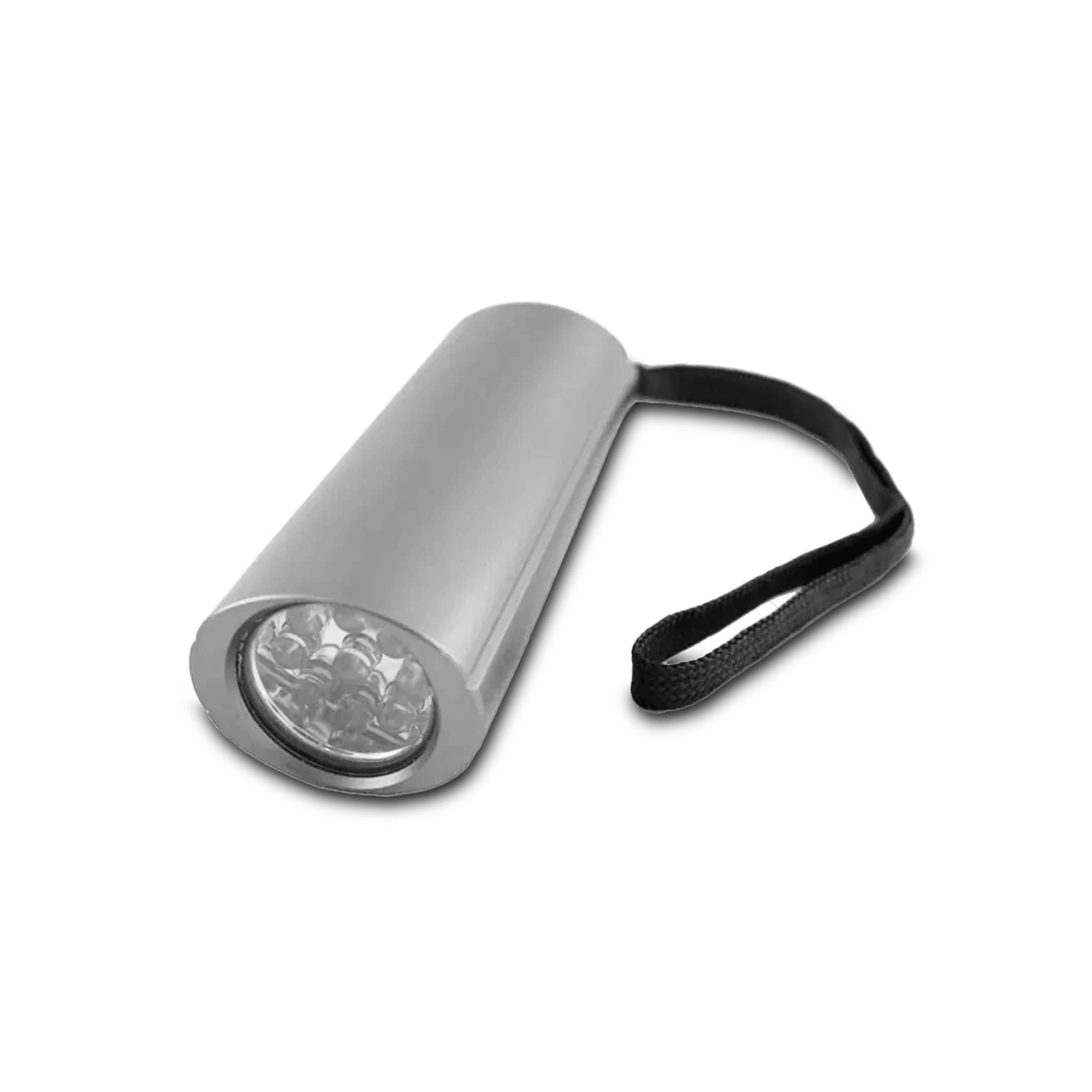
Blaze Ellips
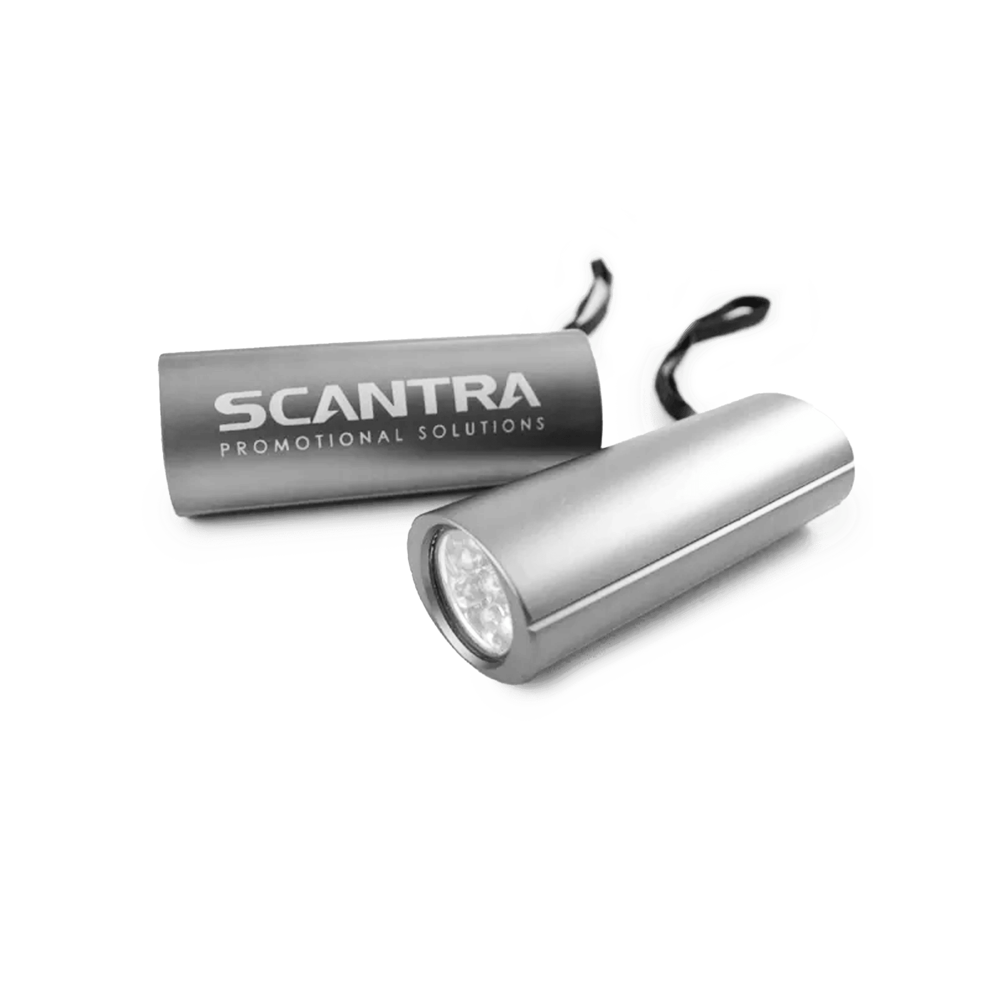
Pocket Blaze HiQ


Blaze Duo Light 2in1